Life at the centre
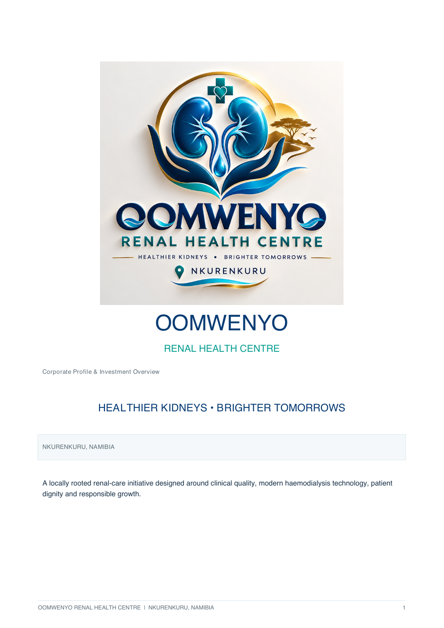
Two kidneys frame a water droplet: a compact symbol of renal health, continuity and the meaning of Omwenyo.
Brand strategy · Identity · Web design · Development
Omwenyo is an emerging renal health centre in Nkurenkuru. We translated a deeply human healthcare vision into a distinctive Namibian brand and an immersive digital experience.
 OMWENYO
Renal Health Centre
OMWENYO
Renal Health Centre
The starting point was a thoughtful corporate profile and several exploratory logo directions. The opportunity was to turn that raw ambition into one coherent public identity—credible enough for healthcare, warm enough for families and unmistakably rooted in Namibia.
The centre is still being established, so the experience needed to inspire confidence without implying that services are already operational.
 Starting pointRefined identity
Two kidneys frame a water droplet: a compact symbol of renal health, continuity and the meaning of Omwenyo.
Protective hands create an embrace rather than a clinical badge, keeping the person visible inside the system.
A rising sun and disciplined flag-colour accents connect the centre to place without turning the mark into a flag.
The core remains calm and clinical. Sun-gold, Namibia red and living green provide moments of energy and meaning.
Motion is treated as atmosphere and explanation: flowing particles suggest water and life; orbital systems show connected care; the roadmap turns responsible growth into something visitors can explore.
Live experienceOpen website ↗Animated gradients, flow particles and depth respond without compromising readability.
Care services and the establishment roadmap reveal content through direct exploration.
Dependency-free code, responsive layouts and reduced-motion support keep the experience fast and inclusive.
OMWENYO
The Oshiwambo name is written with one initial “O”. Its meaning gave the whole identity a north star: technology serves life, and care begins with the person.
Omwenyo Renal Health Centre